 's
Scientific Python Tools
's
Scientific Python Tools
The last big topic to look at is plotting. Thanks to a very nice plotting library called matplotlib plotting of (scientific) data from within python has become almost trivial.
The webpage of Matplotlib is located at:
Matplotlib is mainly for two-dimensional plots (although there are some limited capabilities for 3 dimensional stuff.) We will concentrate on 2D and only show a few very basic examples.
Matplotlib can do a few things more than just plotting. We will use only one submodule, namely matplotlib.pyplot. This is what we need to import before we can do any plotting.
Now let start with plotting and make a first simple example:
In [1]: from numpy import *

In [2]: from matplotlib.pyplot import *

In [3]: x = linspace(-2, 2, 200)

In [4]: y = (x**5 + 4*x**4 + 3*x**3 + 2*x**2 + x + 1)*exp(-x**2)

In [5]: figure()   # Make a new figure
Out[5]: <matplotlib.figure.Figure at 0x3636250>

In [6]: plot(x, y)   # Plot some data
Out[6]: [<matplotlib.lines.Line2D at 0x36e5550>]

In [7]: grid(True)   # Set the thin grid lines

In [8]: savefig("plot_1.png")   # Save the figure to a file "png",
                                # "pdf", "eps" and some more file types are valid
And the result then looks like:
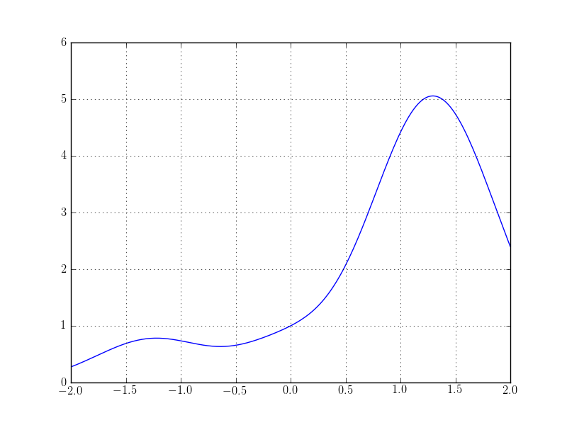
With only a couple of lines of python we get such a nice plot!
Additionally to saving the figure to a file we can also show it right from the python interpreter by using the command show() instead of savefig.
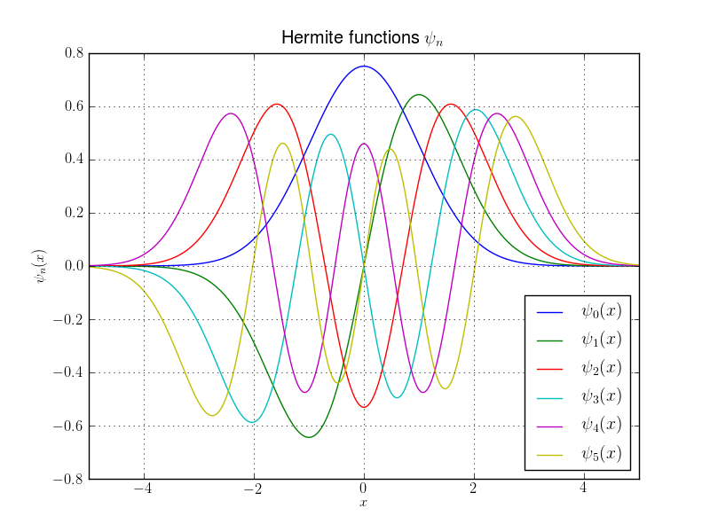
Now there are many options available to change the look or other features of the resulting figure. Usually most have reasonable defaults. In the next example we show some useful things:
In [9]: from scipy.special import gamma
In [10]: from scipy.special.orthogonal import eval_hermite

In [11]: x = linspace(-5, 5, 1000)

In [12]: psi = lambda n,x: 1.0/sqrt((2**n*gamma(n+1)*sqrt(pi))) * exp(-x**2/2.0) * eval_hermite(n, x)

In [13]: figure()
Out[13]: <matplotlib.figure.Figure at 0x3a9be50>

In [14]: for n in xrange(6):
   ....:     plot(x, psi(n,x), label=r"$\psi_"+str(n)+r"(x)$")   # The 'label' to put into the legend
   ....:

In [15]: grid(True)

In [16]: xlim(-5,5)   # Specify the range of the x axis shown
Out[16]: (-5, 5)

In [17]: ylim(-0.8,0.8)   # Specify the range of the y axis shown
Out[17]: (-0.8, 0.8)

In [18]: xlabel(r"$x$")   # Put a label on the x axis
Out[18]: <matplotlib.text.Text at 0x3d06210>

In [19]: ylabel(r"$\psi_n(x)$")   # Put a label on the y axis
Out[19]: <matplotlib.text.Text at 0x3d0a190>

In [20]: legend(loc="lower right")   # Add a legend table
Out[20]: <matplotlib.legend.Legend at 0x3d32e50>

In [21]: title(r"Hermite functions $\psi_n$")   # And a title on top of the figure
Out[21]: <matplotlib.text.Text at 0x3d11590>

In [22]: savefig("plot_2.png")
Which results in:
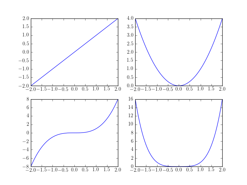
We can easily make a plot that contains several so called subplots
In [3]: x = linspace(-2, 2, 100)

In [4]: figure()
Out[4]: <matplotlib.figure.Figure at 0x362b350>

In [5]: subplot(2,2,1)   # Two rows and two cols of plots, select first one
Out[5]: <matplotlib.axes.AxesSubplot at 0x362ba90>

In [6]: plot(x, x)
Out[6]: [<matplotlib.lines.Line2D at 0x27b2cd0>]

In [7]: subplot(2,2,2)   # Two rows and two cols of plots, select second one
Out[7]: <matplotlib.axes.AxesSubplot at 0x36d7b10>

In [8]: plot(x, x**2)
Out[8]: [<matplotlib.lines.Line2D at 0x38937d0>]

In [9]: subplot(2,2,3)   # Two rows and two cols of plots, select third one
Out[9]: <matplotlib.axes.AxesSubplot at 0x3893c90>

In [10]: plot(x, x**3)
Out[10]: [<matplotlib.lines.Line2D at 0x38b8a10>]

In [11]: subplot(2,2,4)   # Two rows and two cols of plots, select fourth one
Out[11]: <matplotlib.axes.AxesSubplot at 0x38b8e10>

In [12]: plot(x, x**4)
Out[12]: [<matplotlib.lines.Line2D at 0x362b8d0>]

In [13]: savefig("plot_subplots.png")
and we get the following image
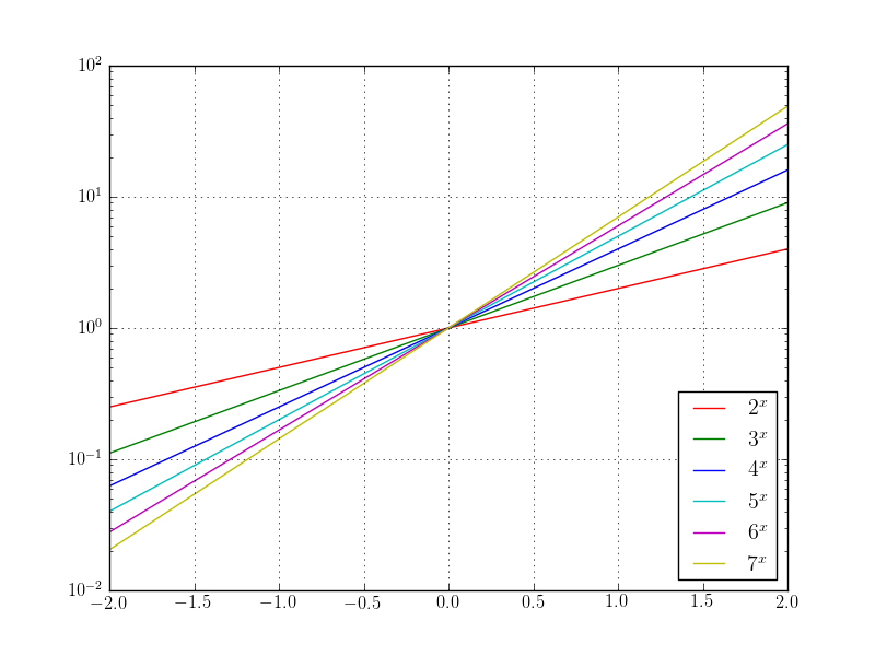
We can make one (command semilogx, semilogy) or both (command loglog) axes log scale
In [70]: figure()
Out[70]: <matplotlib.figure.Figure at 0x3f28850>

In [71]: semilogy(x, 2**x, "r-", label=r"$2^x$")
Out[71]: [<matplotlib.lines.Line2D at 0x54c9410>]

In [72]: semilogy(x, 3**x, "g-", label=r"$3^x$")
Out[72]: [<matplotlib.lines.Line2D at 0x54cf090>]

In [73]: semilogy(x, 4**x, "b-", label=r"$4^x$")
Out[73]: [<matplotlib.lines.Line2D at 0x54bf410>]

In [74]: semilogy(x, 5**x, "c-", label=r"$5^x$")
Out[74]: [<matplotlib.lines.Line2D at 0x5690f50>]

In [75]: semilogy(x, 6**x, "m-", label=r"$6^x$")
Out[75]: [<matplotlib.lines.Line2D at 0x5690f10>]

In [76]: semilogy(x, 7**x, "y-", label=r"$7^x$")
Out[76]: [<matplotlib.lines.Line2D at 0x5690e50>]

In [77]: grid(True)

In [78]: legend(loc="lower right")
Out[78]: <matplotlib.legend.Legend at 0x54d9fd0>

In [79]: savefig("plot_semilogy.png")
In [35]: figure()
Out[35]: <matplotlib.figure.Figure at 0x44f9510>

In [36]: loglog(x, x, "r-", label=r"$x$")
Out[36]: [<matplotlib.lines.Line2D at 0x47f9310>]

In [37]: loglog(x, x**2, "g-", label=r"$x^2$")
Out[37]: [<matplotlib.lines.Line2D at 0x480ce90>]

In [38]: loglog(x, x**3, "b-", label=r"$x^3$")
Out[38]: [<matplotlib.lines.Line2D at 0x480ced0>]

In [39]: loglog(x, x**4, "c-", label=r"$x^4$")
Out[39]: [<matplotlib.lines.Line2D at 0x480f250>]

In [40]: loglog(x, x**5, "m-", label=r"$x^5$")
Out[40]: [<matplotlib.lines.Line2D at 0x480f350>]

In [41]: loglog(x, x**6, "y-", label=r"$x^6$")
Out[41]: [<matplotlib.lines.Line2D at 0x480fe50>]

In [42]: grid(True)

In [43]: legend(loc="lower right")
Out[43]: <matplotlib.legend.Legend at 0x4521710>

In [44]: savefig("plot_loglog.png")
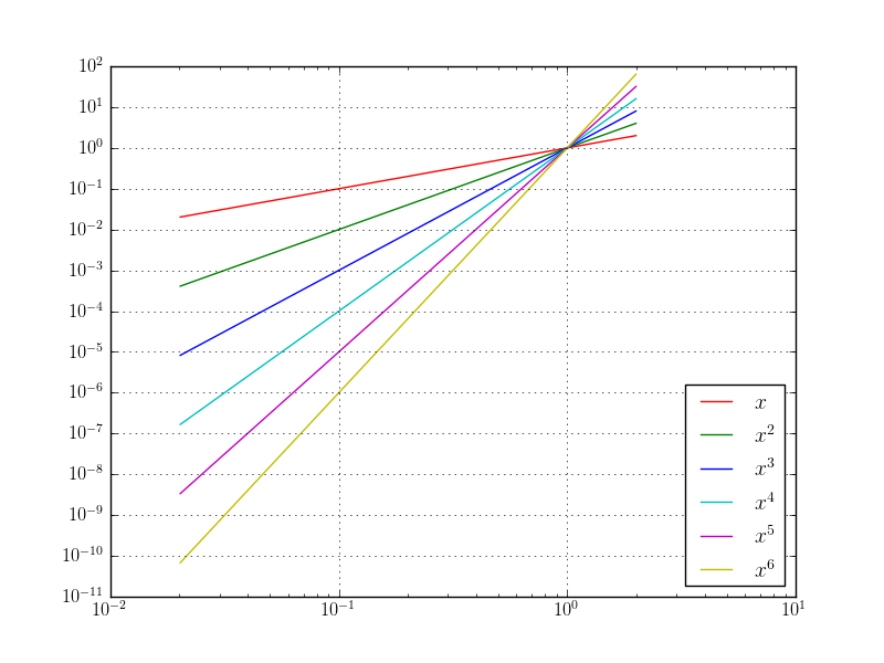
Log scale plots are commonly used for convergence plots as we will see later.
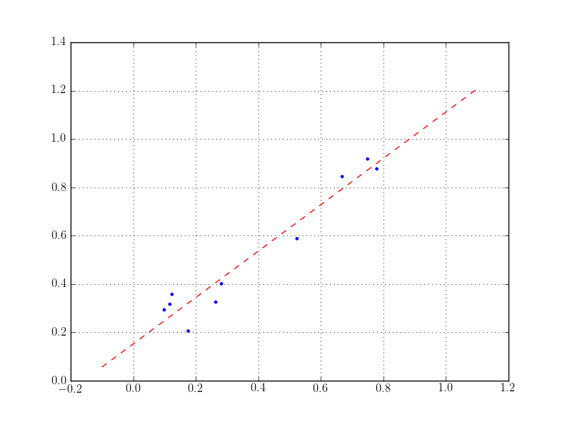
Often one wants to fit some polynomials and plot the result. This is what the following example does. (For fitting in log scaled plots one has to apply log manually before doing a polyfit. The result has to be transformed back again.)
In [6]: x = random.rand(10)       # Some random points
In [7]: offset = random.rand(10)
In [8]: y = x + 0.25*offset

In [9]: p = polyfit(x, y, 1)   # Fit a polynomial of first degree (line)

In [10]: u = linspace(-0.1, 1.1, 10)   # Evaluate the polynomial at (other) points
In [11]: v = polyval(p, u)

In [12]: figure()
Out[12]: <matplotlib.figure.Figure at 0x2e87f10>
In [13]: plot(x, y, ".")
Out[13]: [<matplotlib.lines.Line2D at 0x334ac10>]
In [14]: plot(u, v, "--r")
Out[14]: [<matplotlib.lines.Line2D at 0x3271e10>]
In [15]: grid(True)
In [16]: show()
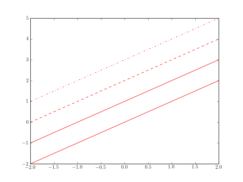
Matplotlib knows many different line and marker styles. The following plot show only a small subset of what’s available.
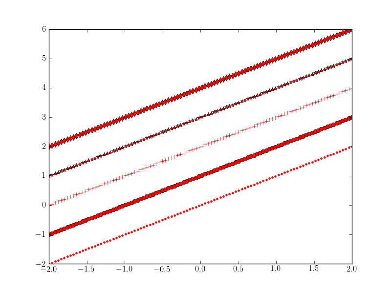
For some more examples see http://matplotlib.org/examples/pylab_examples/line_styles.html and http://matplotlib.org/examples/pylab_examples/filledmarker_demo.html and the reference plots:
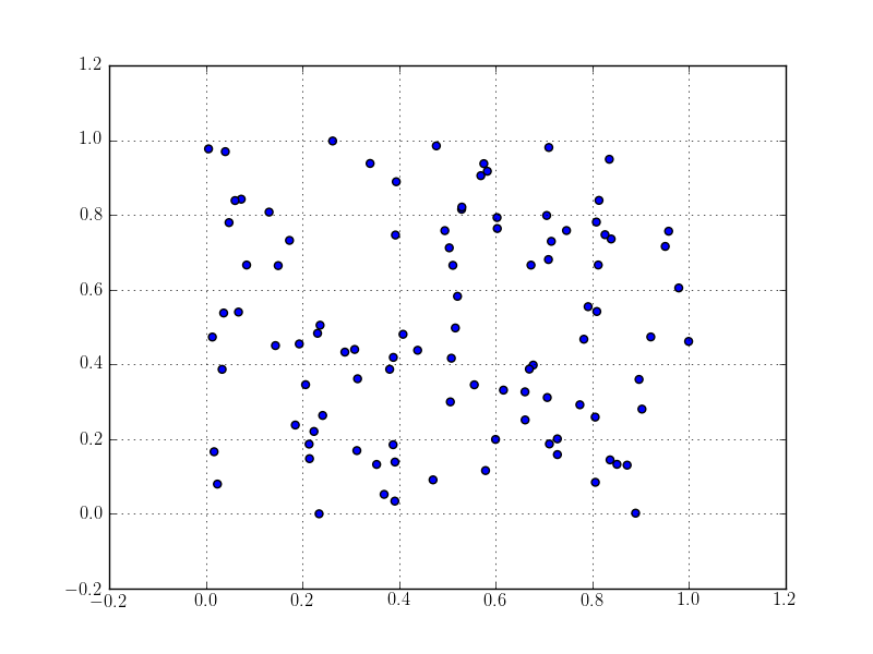
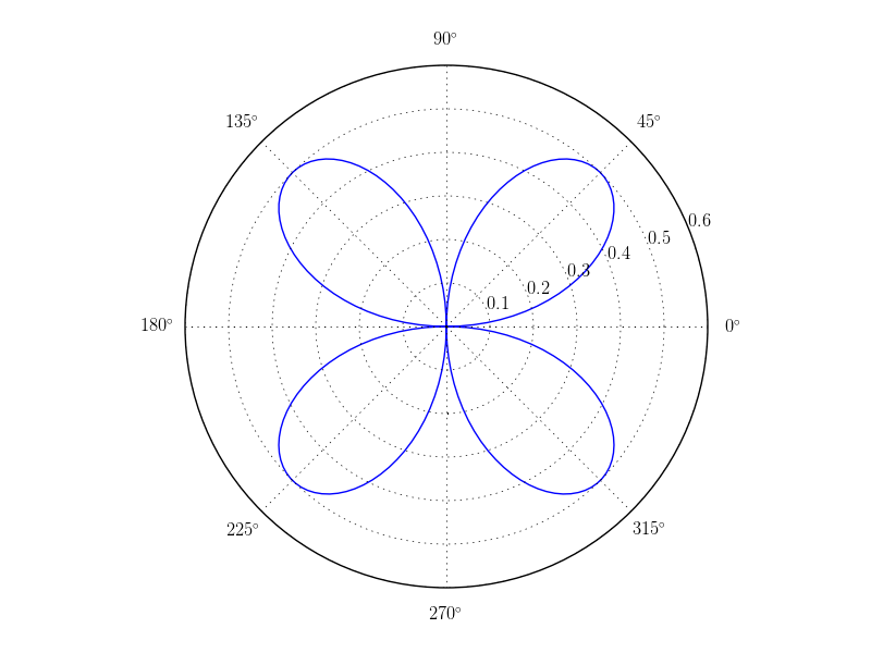
There are several other plot types too, for example scatter plots and polar plots
In [141]: x = random.rand(100)

In [142]: y = random.rand(100)

In [143]: figure()
Out[143]: <matplotlib.figure.Figure at 0x5df78d0>

In [144]: scatter(x, y)
Out[144]: <matplotlib.collections.CircleCollection at 0x6794b10>

In [145]: grid(True)

In [146]: savefig("plot_scatter.png")
In [148]: phi = linspace(0, 2*pi, 200)

In [149]: figure()
Out[149]: <matplotlib.figure.Figure at 0x5cbda50>

In [150]: polar(phi, sin(phi)*cos(phi))
Out[150]: [<matplotlib.lines.Line2D at 0x67a29d0>]

In [151]: grid(True)

In [152]: savefig("plot_polar.png")
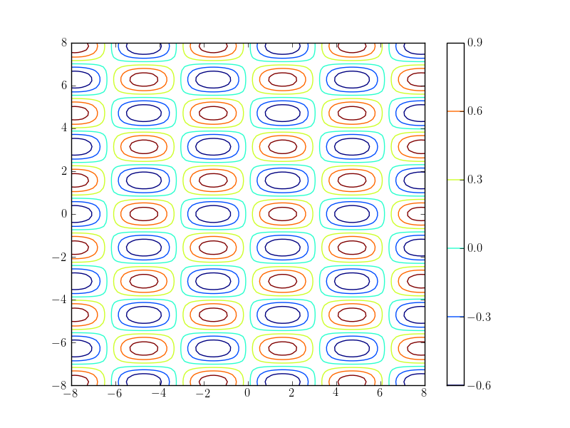
A simple contour plot of an implicit function
In [2]: x = linspace(-8,8,100)

In [3]: y = linspace(-8,8,100)

In [4]: X, Y = meshgrid(x, y)

In [5]: f = lambda u,v: sin(u)*cos(2*v)+0.1

In [6]: Z = f(X, Y)

In [7]: contour(X,Y,Z)   # Plot the contour lines
Out[7]: <matplotlib.contour.QuadContourSet instance at 0x4948b48>

In [8]: colorbar()   # Make a legend for the colors
Out[8]: <matplotlib.colorbar.Colorbar instance at 0x49574d0>

In [9]: show()
Matplotlib knows many more plot types like advanced contour and density plots, matrix and discrete plots, stem plots, stream lines, vector fields, various types of charts and histograms as well as some (limited) 3D plotting.
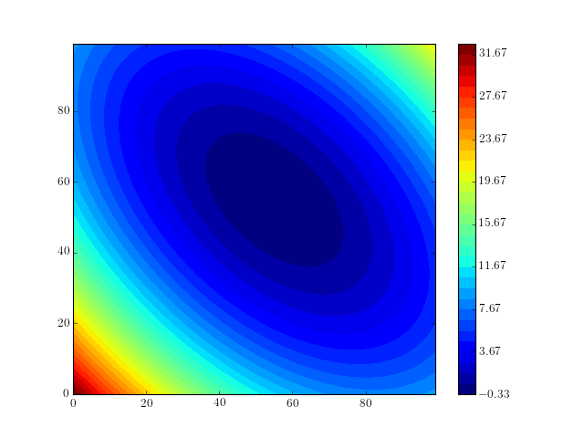
To end this chapter we show a somehwat longer contour plot example
from numpy import *
from matplotlib.pyplot import *

# Data of the quadratic form
A = array([
        [2., 1.],
        [1., 2.]])

b = array([1., 1.])

# Mesh
Nx = 100
Ny = 100

X, Y = ogrid[-3.:3:Nx*1j, -3.:3:Ny*1j]   # ogrid is similar to meshgrid

z = zeros(2)
Z = zeros(Nx*Ny)

# compute values
k = 0
for x in X[:,0]:
    z[0] = x
    for y in Y[0,:]:
         z[1] = y
         Z[k] = 0.5*dot(z,dot(A,z)) - dot(z,b)
         k += 1

Z = Z.reshape(Nx,Ny)

# Plot
levels = arange(Z.min(), Z.max()+0.01, 1.0)   # How many contour levels and where
colormap = cm.get_cmap('jet', len(levels)-1)   # Add a nice color map

figure()
contourf(Z, levels, cmap=colormap)
colorbar()   # Add the color bar legend
show()
(Source code, png, hires.png, pdf)
The official tutorial is also quite a good introduction. You should continue reading:
if you want to know more right now. Another very good tutorial with many examples is this one:
It is always a good idea to look at the Matplotlib gallery
when you intend to do a new kind of plot and are not sure how to continue best. The gallery contains many examples with full source code of almost every plot imaginable. You might get either your ploting program already tipped or good visualization ideas. There are also two less prominent spots to look for examples: